Griffin Technology
Packaging Design / Product Marketing / Creative Direction
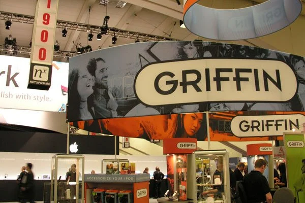
The first week at Griffin Technology was Macworld 2005. New job, unfamiliar products, a trade-show booth to get ready, and a crash course in the rapidly expanding world of iPod accessories. There wasn't much time to ease into things.
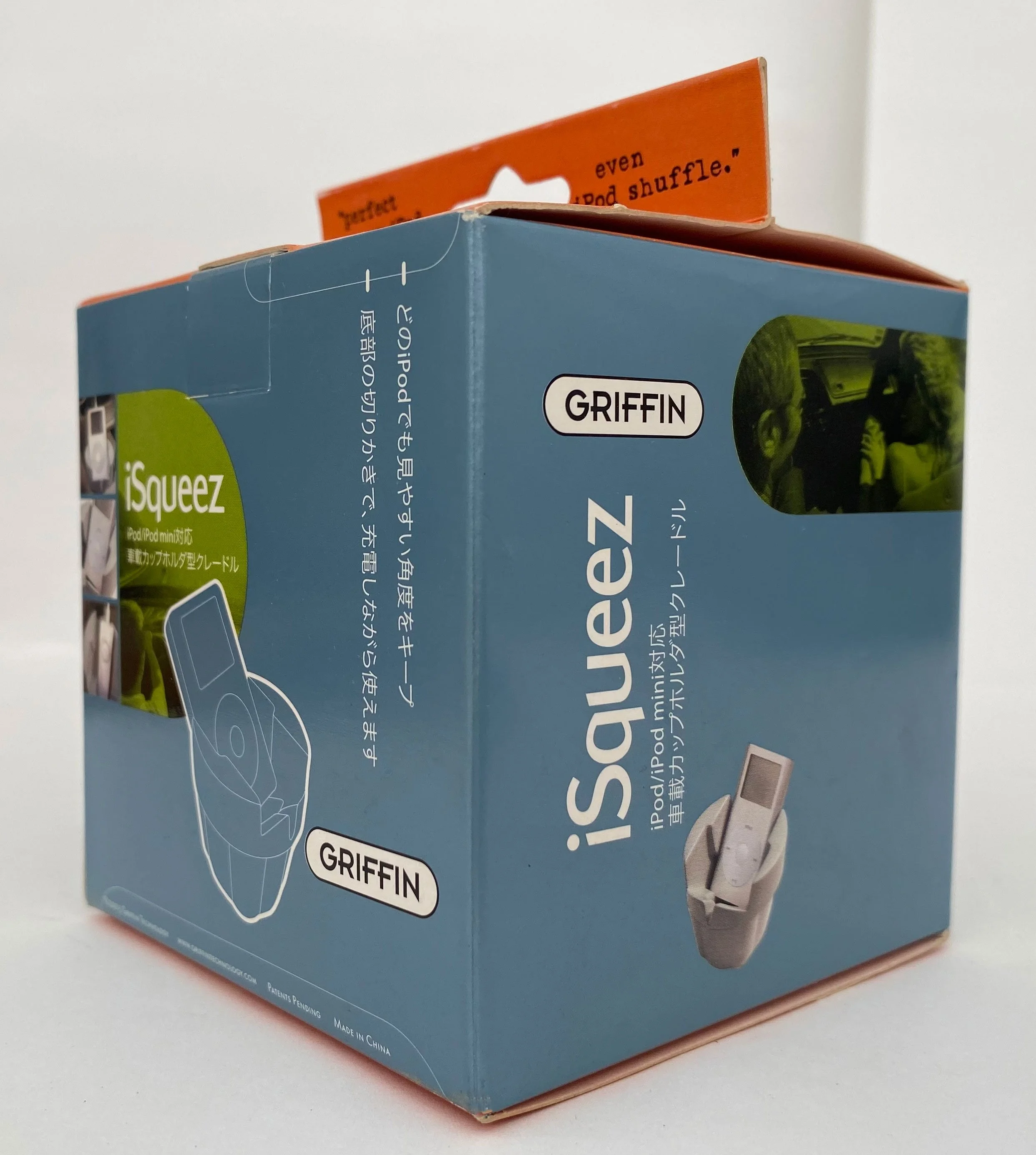
The opportunity to contribute had actually started during the interview, when a cupholder accessory acquired a name: iSqueez. It was an early indication that good ideas didn't necessarily wait for a formal assignment.
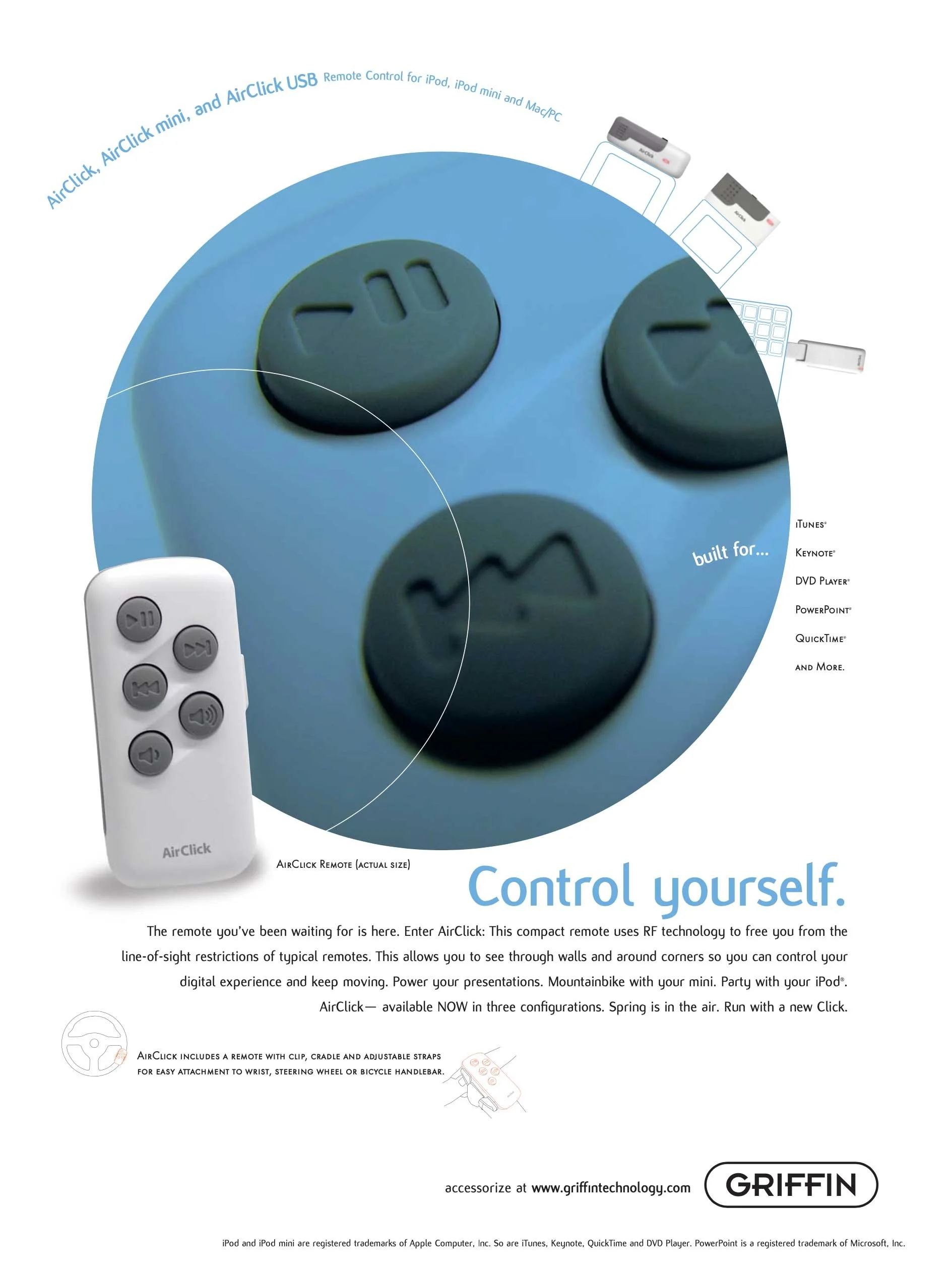
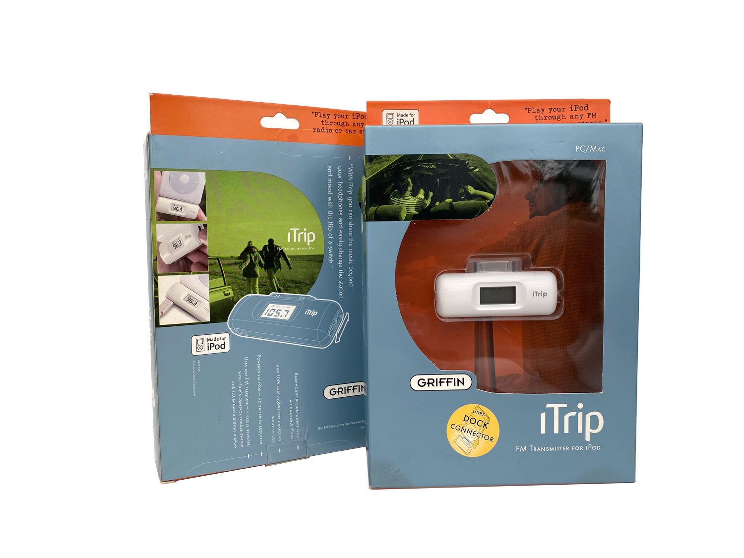
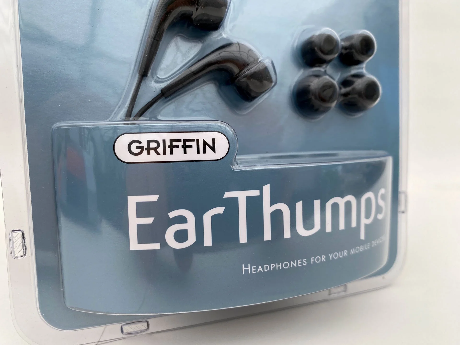
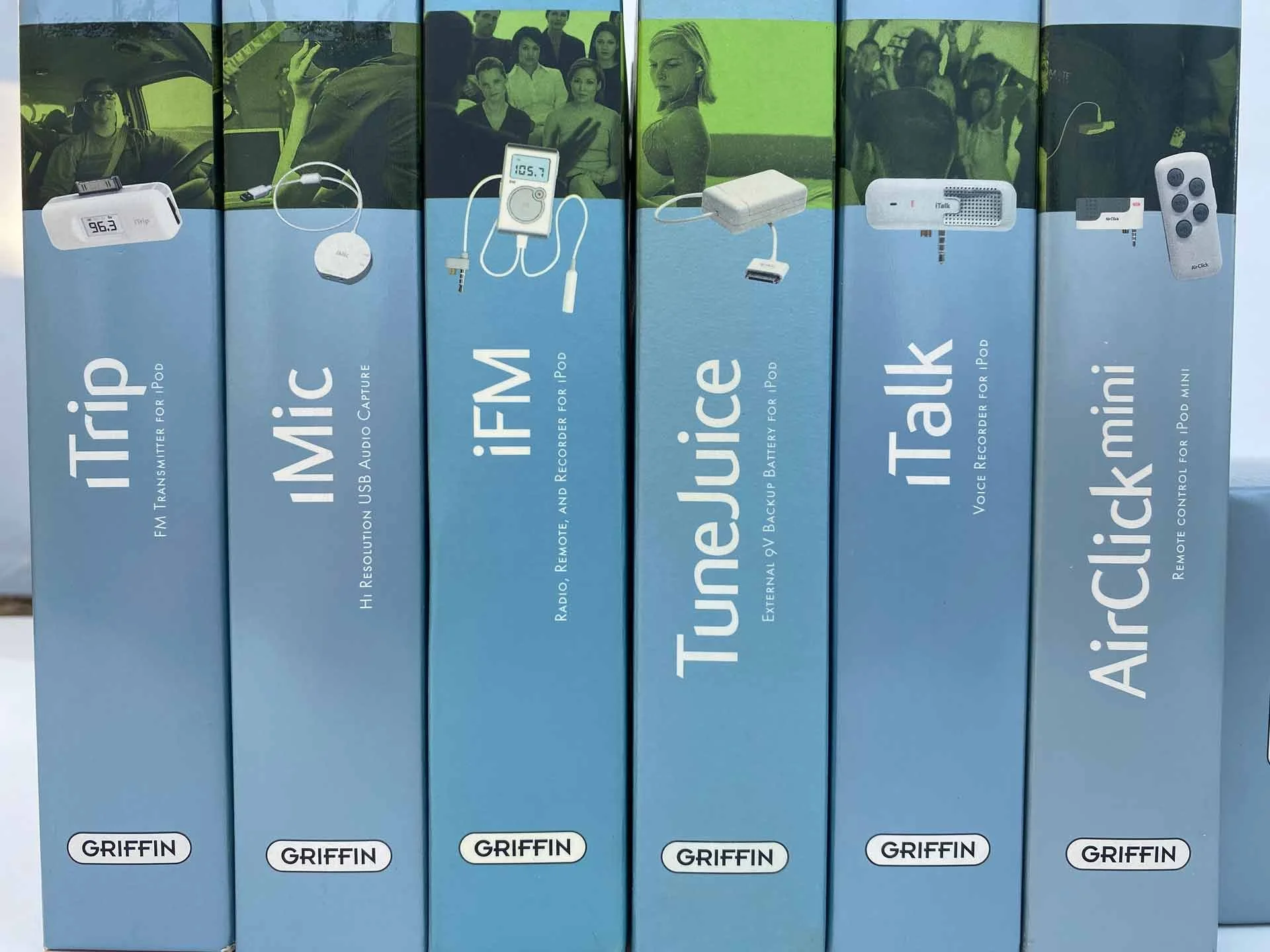
Later that year, as Griffin's products entered major retailers including Target and Best Buy, packaging became an opportunity to establish a more recognizable presence on the shelf. A vibrant system of blue, orange, and lime green broke from the Apple-inspired white packaging common throughout the category and gave Griffin a visual language of its own.
The products were already doing interesting things. The packaging just needed to stop dressing like everybody else.
2005